Aesthetics Marketing: Getting Brand Imagery Right

In the latest in our series 10 Tips for Marketing your Aesthetics Practice we explore why branding is an important part of aesthetics marketing. We also focus on the types of considerations you need to reflect on when putting together your brand imagery in order to attract your ideal patients.

What is brand imagery and why do you need it?
Branding is the visual signature people associate with your brand. It’s how they know a post on social media is yours without you having to write your name on it.
People commonly associate branding with having a logo but there is actually a lot more to it. In addition to boosting the perception of your business, these factors can be fun to explore if you want to flex your creativity!
This form of subliminal communication tells the viewer what you’re about, even if they don’t read the caption. And believe us, any marketing professional will tell you that fewer and fewer people read so a picture truly is worth a thousand words…
Here we look specifically at how to use imagery within your aesthetics marketing to cultivate a professional image and attract targeted clients.

Basic branding tips
When you first start your aesthetics business, take some time to put together the following components – known as assets…
- A colour palette you can use across your business – from your digital and printed marketing materials to interiors and even your work outfits or scrubs.
- A text logo with your company name in.
- A picture logo without your company name in.
In terms of logos, it may help to think of some of the best-known international brands when considering what you’re looking for. Don’t confine yourself to just aesthetics, medical or beauty brands – inspiration can come from anywhere!
For example, Apple changed the branding game for many companies as its sleek, minimalist white aesthetic with its basic apple graphic and plain text logo caught on. As it proved popular with tech fans, other companies saw its success and started to streamline their own branding as a result, creating a trend for this type of branding.
Nike and Coca-Cola are two of the world’s most recognisable brands whether you see their text logos – “Nike” or “Coca-Cola” – their strapline logos – “Just Do It” or “It’s the Real Thing” – or their image-only logos – the Nike Swoosh and the Coca-Cola white wave.
This exercise doesn’t have to be expensive – you can do it yourself or enlist the help of creative friends! It can, however, have an important effect on how your business is perceived. Particularly in terms of professionalism, approachability and building trust with your existing and potential patients.
If you want to take it a step further, do some research into colour theory when choosing your brand colours so you can tailor your messaging on an even deeper level.
Make your imagery and messaging inclusive
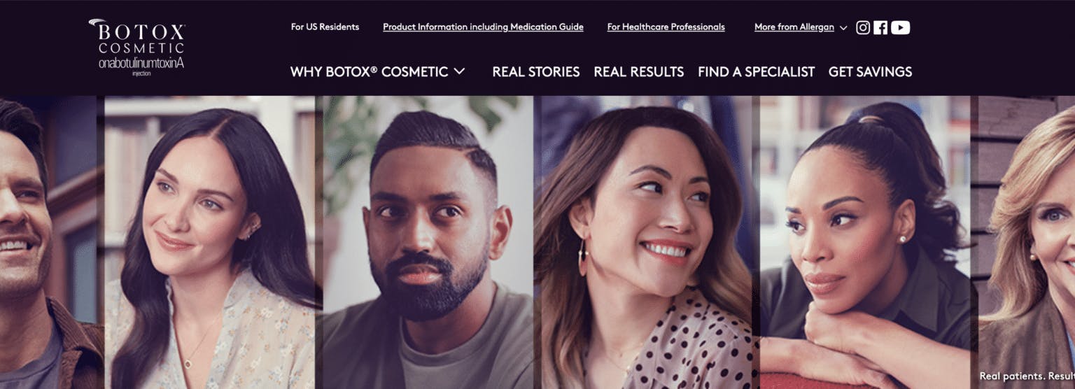
When considering the imagery you use to promote your brand, it is crucial that the people shown in these photos reflect your true – or desired – target audience of patients.
Remember your Ideal Patient avatars from the second article in this Aesthetics Marketing series? These play a key role in what your images should show so have this information to hand when writing up some brand image guidelines for yourself.
Always consider the wants and needs of this target audience when designing any activities, especially those where you need to visually represent the patients you want to attract.
The goal here is for potential and existing patients to see themselves represented in your imagery. You should include photos – with all appropriate consents and permissions! – of people that reflect the society you practice in.
• Make sure various age groups are included.
• Show a mix of genders.
• Ensure you feature a wide range of races and skin tones.
People need to know what you offer and – equally importantly – who you offer it to. If they don’t see themselves incorporated into your brand’s messaging, how will they feel comfortable coming to you?
This is such a basic requirement, yet it is one many aesthetics businesses across the world fail to meet. Numerous studies have shown that aesthetic medicine relies heavily on young, 20-something white women for its marketing images, excluding other races, ages and genders.
Allergan has sought to address this issue in its latest advertising campaign for Botox, entitled “See Yourself”. Click through above to watch the campaign videos which may provide you with inspiration!
There are, of course, other types of images you can use in promoting your business and you can find details of these in our previous piece on the rules for using photos and videos in aesthetics marketing.
We hope you find this advice useful and would love to hear your feedback if you try out any of our tips!
All information correct at the time of publication
Download our full prospectus
Browse all our injectables, dermal fillers and cosmetic dermatology courses in one document
By submitting this form, you agree to receive marketing about our products, events, promotions and exclusive content. Consent is not a condition of purchase, and no purchase is necessary. Message frequency varies. View our Privacy Policy and Terms & Conditions
Attend our FREE open evening
If you're not sure which course is right for you, let us help
Join us online or in-person at our free open evening to learn more
Our Partners







STAY INFORMED
Sign up to receive industry news, careers advice, special offers and information on Harley Academy courses and services

